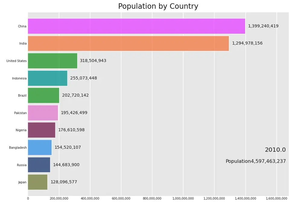
Recently, I come across a medium post on announcement off Official Release of bar_chart_race by Ted Petrou. In his article, he provides an excellent tutorial on how to create Bar Chart Race using bar_chart_race package. Check out the official document here .
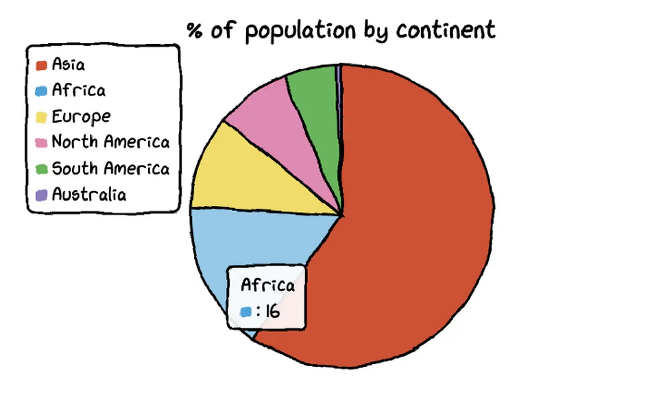
In our example we use a World Population from 1955 to 2020 dataset from kaggle or you can directly download dataset here .
Installation of Bar Chart Race package
pip3 install bar_chart_race pandas
or using anaconda:

